Utair
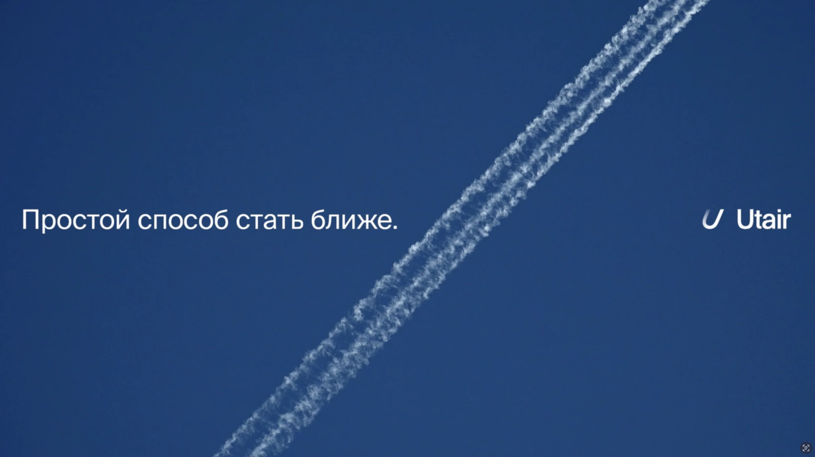
An easy way to get closer
An easy way to get closer
We conducted several studies, both of the airlines' customer audience and interviews with Utair employees and the management team, to better understand the essence of the brand and the core values that stand behind the business and the brand. The main conclusion was that for the Russian audience, domestic flights and airlines are perceived as -- an elevator: you need to get to your destination quickly and without incident.


We thought that the two key words that should define our identity in the future are simplicity and closeness . Simplicity — because this is what people expect at the service level when it comes to air travel. Closeness — because we're focused on domestic flights, which often mean trips to hometowns and to loved ones. This is exactly what we reflected in the new visual identity of the brand and internal communication with employees — "A Simple Way to Get Closer."
When developing the brand identity, it was important to maintain the principle of "simplicity" across all visual materials and numerous touchpoints with the audience. It wasn’t enough to simply create a new logo — we wanted to convey the right emotional tone of the brand. That’s why we updated all formats: from aircraft livery to crew uniforms, from the company website to the in-flight passenger menu.
Google
Time to find answers
Time to find answers